%2010_59_22%E2%80%AFa_m_.png)
A website built to inspire trust
from the very first click.
For small business owners, choosing a marketing agency isn’t just about hiring services. It’s about trusting a partner who understands both their dreams and their limits.
That’s how Bee too Reel was born: a marketing agency focused on boosting digital presence, tailored for SMEs.
But here came the irony—Bee too Reel had no digital presence of its own. The proposal was solid, but invisible to potential clients.
| Role
UX/UI Designer
| Timeline
April 2025 - June 2025
| Tools
Figma, AI, Google Workspace.

A website built to inspire
trust from the very
first click.
For small business owners, choosing a marketing agency isn’t just about hiring services. It’s about trusting a partner who understands both their dreams and their limits.
That’s how Bee too Reel was born: a marketing agency focused on boosting digital presence, tailored for SMEs.
But here came the irony—Bee too Reel had no digital presence of its own. The proposal was solid, but invisible to potential clients.
| Role
UX
Designer
| Timeline
April 2025 -
June 2025
| Tools
Figma, AI,
Workspace
The challenge
An agency that sells visibility...
but had none.
Bee too Reel had what it takes to stand out in a saturated market full of agencies promising quick-fix miracles that only lead to distrust.
The paradox? The agency had no digital footprint.
The solution
Designing for what truly matters
to small businesses.
Designing a website that’s clear, honest, and strategically built to build trust from the first click.
No fluff. Just thoughtful decisions and language that speaks the same way SMEs do.
🧠
Listening and hearing are not the same…
So I listened carefully…
During interviews and forms, a clear pattern emerged: small business owners don’t want flashy promises. They want clarity, warmth, and results that match their reality.
Looking into Bee too Reel’s top competitors confirmed why the distrust existed: most agencies don’t truly listen. They just hear. They fail to turn their promise into something practical and human.
And that’s not just a hunch:
45% of SMEs said they’ve hired a digital marketing agency before.
75% said the experience left them confused or unsatisfied.
Why? →
Real Talk
That’s where the real edge was—Bee too Reel didn’t need to shout louder to stand out. Just speak clearly:
‘No empty promises. Just what your business really needs’.

Rodrigo, 37, neighborhood café owner.
Lack of clarity:
I need to see a monthly plan that outlines the goals we're aiming for.
Lack of guidance:
I feel like my digital presence falls short compared to the competition, but I don’t know what I should improve.
Confusing language:
I'm tired of jargon and wasting time (and money) on strategies I don't understand—and that don’t show results.

Lack of clarity:
I need to see a monthly plan that outlines the goals we're aiming for.
Lack of guidance:
I feel like my digital presence falls short compared to the competition, but I don’t know what I should improve.

Rodrigo, 37, neighborhood café owner.
Confusing language:
I'm tired of jargon and wasting time (and money) on strategies I don't understand—and that don’t show results.
That’s where the real edge was—Bee too Reel didn’t need to shout louder to stand out. Just speak clearly:
‘No empty promises. Just what your business really needs’.


Camila
Growing Entrepreneur

Jorge
SME Owner


Valentina
Independent Consultant
🐝
Mi Bzzz! moment
Trust isn’t designed with promises,
it’s built through decisions.
The insight was clear: if Bee too Reel’s edge was truly listening, then the digital experience needed to reflect that.
Every block, message, and interaction had to match the tone their audience already trusted: simple, helpful, and clear.
That’s when the design focus started to take shape:
How do you create a website that builds trust without over-explaining?
It meant thinking through the structure, prioritizing real content, and crafting a clean, frictionless flow.

⚠️ Problem Statement
A brand built to truly listen to small businesses—yet stuck in the same digital silence it set out to challenge.
The question was clear: How do you design a web experience that breaks away from generic promises and speaks to what really matters to this audience?

🏆 Value Proposition
A clear, approachable, and strategic website where every section helps users decide—not second-guess.
With this redesign, Bee too Reel becomes more than a marketing agency: it becomes a trusted partner, aligned with what SMEs truly need.
With the concepts more defined, I landed on three key principles:
🐝 Clarity before visual impact
The focus was on information hierarchy and a simplified path. The first thing users needed? To understand what the agency does and how it helps.
🐝 Real talk, real words
I replaced jargon and filler phrases with copy that felt real, accessible, and still professional. No smoke, no mirrors.
🐝 Design that guides, not pressures
From layout to CTAs, everything was meant to support decision-making—not rush it.

💡
Turn trust into design decisions that make
an impact.
This wasn’t about making things look good. It was about making them make sense.
But from what angle do you approach that to create strategic impact?
I started by breaking the initial block and letting ideas flow—exploring layout sketches that prioritized clarity without feeling obvious:
How to…?
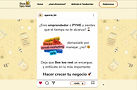
Before handing off to dev, I needed to make sure v1.0 did its job.
So I ran a small test with the main stakeholder and two SME owners.
Their feedback?
“Easy to understand” | “Professional but warm” | “It builds trust”
That early validation proved the experience was already speaking the right language—one that invites users to connect and believe.
🖌️
This was no longer just design
it was about the experience.
Building trust visually isn’t about beauty for beauty’s sake. Every section had to guide, not just decorate.
The process started with wireframes focused on a clear hierarchy and quick orientation. From the landing to service details, I designed to answer questions before users had to ask.
In the final prototype, the copy flowed like a conversation: titles that inform, descriptions that ease anxiety, and CTAs that invite, not push.
To keep consistency, I used AI as an early partner to test realistic copy and different tones until I struck that perfect balance between friendly and professional.
This approach echoed what Bee too Reel already stood for: a team that gets SMEs instead of just talking at them.
Let’s do it!
🧱 Wireframe
A layout with a clear purpose for each section: to guide first-time visitors and support smart decisions.
%205_10_06%E2%80%AFp_m_.png)
✏️ Lo-fi
Before diving into style, I validated simple flows and interactions to ensure the narrative felt intuitive and helpful.
%205_10_22%E2%80%AFp_m_.png)
🎨 Hi-fi
The final design kept a clean look but used color, typography, and CTA hierarchy to convey trust.
%205_10_38%E2%80%AFp_m_.png)
🎨 Style
From iconography to tone, the visual language reinforced Bee too Reel’s identity as a grounded, realistic agency.
Nothing extra. Every detail had a reason.

🎤 Mic drop!
Designing from trust, not just a promise.
This wasn’t about making a beautiful website. It was about translating Bee too Reel’s purpose into a trustworthy digital experience, built for those who need it most.
After user validation and small iterations, the new site is ready for the agency’s next big step: standing out in a noisy market and attracting clients who value real over loud.
And as a designer, I took this with me: when you really listen, you don’t need to over-design.
You just design with purpose—and let that drive action.